Assisted on this campaign which in a short time frame had to be created for use accross various print and digital applications. This included web banners, transit ads, billboards and more.
I art directed and produced this direct mail brochure that was sent out to Citi American Airlines clients. It inluded an extruding 3D cut-out where the 2X offer was emphasized.
I illustrated and produced this coloring book in the style of the popular Chicago street artist Bearchamp for an internal Havas event. Short clip can be seen here.
Several billboard design concepts that I created and presented and later produced for Cracker Barrel.
A direct mail brochure that I art directed and produced for final print production for Citi Simplicity card.
A direct mail brochure that I art directed and produced for final print production for Citi Prestige card.
Adidas digital social assets for a new shoe release. Includes banner pages and instagram post graphics.
Several ATM digital display graphics that I art directed and produced for Citi.
Angostura print ad that I helped design and produced at the top and a digital banner below.
I produced these full page advertisements for Hefty that went into dozens of different publications. I made sure to make these print ready and had two different layouts depending on if the ad was placed on the left or the right side of the spread. Then made sure the publication received the correct art.
Cover of a white paper and a life-sized, 6’ infographic board that I was tasked with designing for Havas Media during their succesful pitch to win Michelin as a client.
I art directed and produced these “neck hangers” for several Havas clients. These were folded and went over the neck of a bottle to attract more attention and provide more engagement with the brand.
A few concepts that I presented to a client for a partner summit. Iconography is inspired by existing brand element, which is the star you see in the top concept and also the general theme of tele-connectivity.
Here is a preview of an exciting animation that I am a part of. Below you can see several stills from a storyboard about the effects of Toll-Free texting.
Another preview of a work in progress. This is a branding project for a Toll-Free Summit. More snapshots coming soon!
To increase brand awareness, TCS Education System launched a Chicago Transit ad campaign for The Chicago School of Professional Psychology. This campaign consisted of digital displays, a takeover of the Belmont station, as well as an exterior train wrap.
In addition to collaborating with other designers to create the Belmont Station graphics, I also had the opportunity to design the train wrap and the content for the digital displays.
My approach to this project was to create a simple design that relied on existing brand colors and elements to establish brand recognition.
Insight magazine is the alumni publication of The Chicago School of Professional Psychology. For this issue, I was tasked with redesigning the main template, layout for all of the content, and illustrating the cover along with the cover story.
TCS Education System had been utilizing Adobe's Digital Publishing Suite for several years. With Adobe's release of Experience Manager, I took it upon myself to learn about the new software and began designing a more modern and user friendly way for potential students and affiliates to access information about TCS Education System.
The Graduate Research Forum is scholarship focused, annual event held at all campus of The Chicago School of Professional Psychology. The goal of the Graduate Research Forum is to connect students with other members of the campus community to foster collaboration and further the sharing and development of ideas.
I was tasked with creating a unique logo for this event that worked alongside the current Chicago School logo. Below are a few of the concepts I presented, with the top being the one that was chosen.
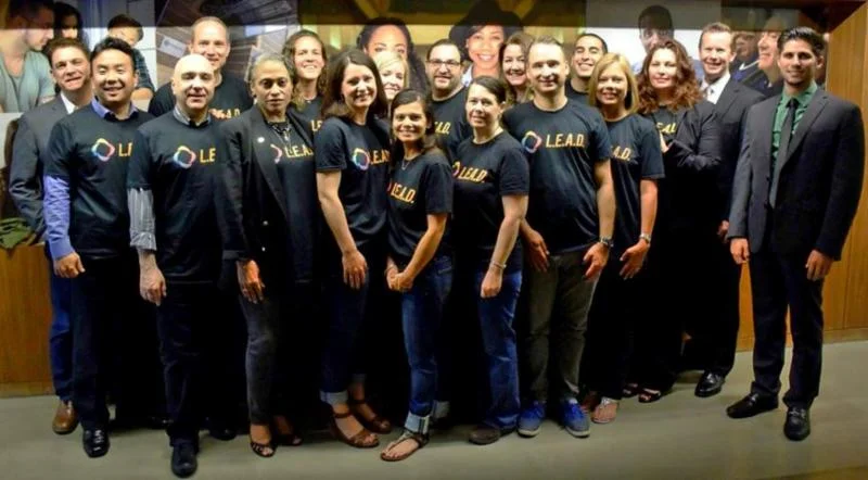
The following logo was created to represent a three-day Leadership Excellence and Development (LEAD) program that was held at The Chicago School's Los Angeles Campus. I came up with the design elements by focusing on the negative spaces found in the school's primary logo. There was a good chance It was likely that they would be used side-by-side and I wanted to ensure that they would be congruent. The abstract figures create a bond that demonstrate unity, illustrating the role that cohesion plays in leadership. The spectrum of colors represents The Chicago School's diverse student population.
The Santa Barbara Colleges of Law had considered updating their logo. Below are a few of my concepts that I presented along with the sketches showing the process I took.
When you have me as the commissioner of your fantasy football league, you get epic personalized invitations based on your team preference.
The Latino Family Studies Specialization is offered to students pursuing their Master’s in Marriage and Family Therapy. Shown are my two concepts for a unique identifier for the program. The left concept includes a traditional Latin-American color palette and imagery in the shape of Central and South America. In creating the right concept I took inspiration from the lively shapes and typography which can be observed in Latin art.
To reconnect Saybrook University’s brand with its humanistic core, I was tasked with creating the school's new brand identity. Given the president’s personal signature, I was instructed to use that as inspiration for the new calligraphic logo.
Below is my presentation of the new identity and a few examples of how it is used today.
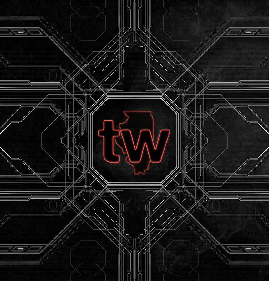
While working for Guild Capital, the parent company of Techweek, I was tasked with updating the conference's city logos. My approach was to simplify the existing logo by abbreviating the city name, removing the year to create consistency and to rejuvenate the logo with a vibrant blue color.
While at Techweek, I was given the opportunity to design a wide variety of promotional and operational pieces and here, are just a few of my favorites. The 2014 Chicago conference program was the first magazine that I got to lay out. Dropbox had purchased some ad space and even let me design their ad! Some of the other pieces included are a calendar I created for the website, digital signage from the conference and an example of the types of logo walls I created to assist the sales team.
This pattern is intended to illustrate the intricacies and inter-connectivity that is present in todays thriving tech world. I aimed to present Techweek, a leader in technology conferences, as high-achieving and forward-thinking through a futuristic design.
Future Sound was a three-day music festival that took place during Techweek Chicago. I designed the festival map as well as took part in rebranding efforts of the festival logo. Below are a few sketches as well as two concepts further illustrated.
While at Guild Capital, I created the following logo for a new event company called The Gathering Group. The rectangular shape with the abbreviation conveys upward motion while the bold lines demonstrate authority and confidence. The typeface also compliments the angles and weight of the icon.
This was designed for another Guild Capital company. To create this design, I integrated aspects of the houndstooth pattern. In this concept, I manipulated the distinct angles found in houndstooth and utilized the bold, contrasting colors traditionally seen in the pattern.
The coach for Six Point Aquatics reached out to me to design a logo that would serve as a new identifier for his team. I was given the specific instructions of incorporating the Chicago star and a compass. To relate these elements to the sport, I incorporated a wave and utilized a cool blue color palette.
OneGlobe Citizen is an online publication that seeks to educate and inspire the readers through global citizenship and the human experience.
I was contacted to translate this unique vision into a logo that could represent the brand for years to come. After presenting several concepts we narrowed it down to an interwoven design that symbolizes how we are all connected as people.
This small business was founded by a good friend of mine, Eric Siedel. He designs and build a variety of unique toys and puzzles for both kids and adults. I've had the pleasure of working with Eric and a handful of projects over the years and here are a few of my favorites.
While completing my degree at Harper College, I interned for a local Harley-Davidson dealership. Needless to say, I was ecstatic. This was an amazing opportunity, and I was given the chance to design in-store signage, social media graphics, monthly mailers, banners and more. I even presented my concept for a store logo redesign, which can be seen at the beginning of this gallery.
While a student at Harper College, I had the opportunity to work on a couple freelance projects for Northshore University Healthsystem Hospital.
Simply Chicago was the theme of that year's annual gala, and below are a few pieces of the marketing materials that went out to invited guests.
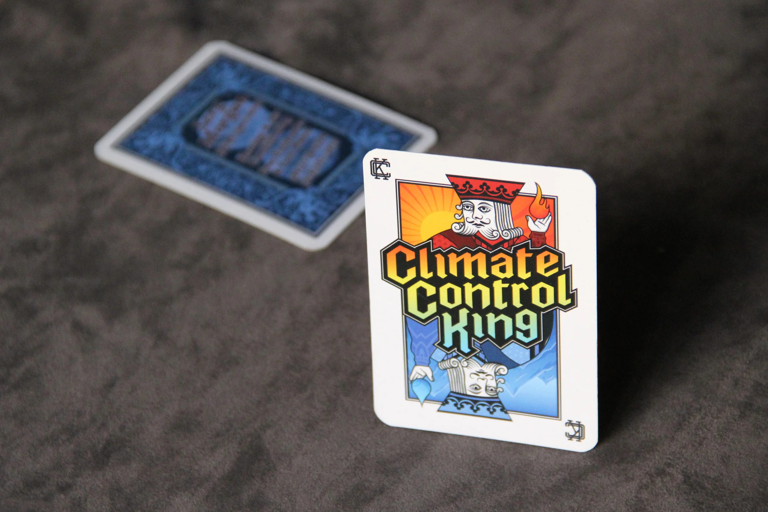
When asked to help brand my Father’s heating and A/C company, I wanted to design a truly distinguished business card. The card is larger than a typical business card so that, physically, the card will stand out. I also played on the idea of hot vs. cold to create a visual concept of the work my father’s company offers.